Candlestick charting techniques have been around for over 100 years and began in Japan. Homma, a Japanese man discovered that the difference between the value and the price of rice was greatly influenced by the emotions of the rice traders. The principles that he established for rice trading are applicable to stocks as they are currently traded today. This formed the basis for candlestick chart analysis which is used to measure the market’s emotions towards stock. The idea behind candlestick charting is to take advantage of forecasted price direction change for any selected time period.
Japanese candlestick charts were developed before the bar chart and the point-and-figure stock charts were is use and they are still the preferable chart for most traders. Candlestick charts are considered to be more visually appealing and therefore are easier to read. These charts are also flexible because they can be used alone or in combination with other technical analysis tools. This provides a significant advantage for candlestick charting techniques over other trading techniques, and it provides an extra element of analysis.
To a technical stock trader, the importance of candlestick trading is that it explains the relationship between the opening and closing stock prices. This is the most important part of candlestick analysis. When the opening price is above the closing price the candlestick chart is typically referred to as the black candlestick and conversely when the opening price is lower than the closing price, a white candlestick will form. This is pretty easily distinguishable when looking at the candlestick chart.
There are two patterns that are pretty much the most basic candlestick patterns that are used in candlestick charting techniques, and they are called the doji candlestick and the bullish engulfing.
This doji candlestick is formed when the opening stock price and closing price are the same or very close. What this means in the market is that the bulls and the bears are conflicted and the investors must take action. The action the investor must take however depends on where it occurs in the trend. If it occurs at the bottom of an extended downtrend, the investor must look for buying signals to confirm the reversal. Conversely, when the doji appears at the top of a trend, in an overbought area, this indicates to the investor that he or she should sell immediately.
The engulfing candlestick pattern is a major reversal pattern made of two bodies that are opposite colors. The bullish engulfing pattern forms after a downtrend and it opens lower than the previous day’s close and it closes higher than the previous day’s open. As a result, the white (hollow) candle completely engulfs the previous day’s black candle. A white (hollow) candle is representative of a day when the close was higher than the previous day’s open, and the black candle represents a day when the close for the day was lower than the previous day’s close.
There is a lot more to understanding candlestick charting techniques. Traders should learn first about the 12 major signals, and then they can move onto learning about the secondary candlestick patterns that are used in Japanese candlestick charting.
Market Direction
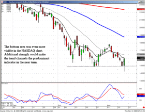
Knowing what each individual signal looks like allows for perfect timing when a reversal could potentially occur. This was illustrated in the Dow chart as well as the NASDAQ chart today. What constitutes the definition of where a reversal could potentially occur? At any level that can be conceived by many investors as a support or resistance level. Yesterday the NASDAQ closed right on the recent lows. The Dow chart was approaching that same area. Stochastics were not quite to the oversold level, but they were getting relatively close. With the setup of these indicators, two assumptions could be made. The current lows could act as a support level or if the current lows were breached with a strong bearish candle today, wave three was then in progress.

NASDAQ
The early-morning trading started the markets off in a negative direction. The Dow was down at least a couple hundred points in the morning. The NASDAQ was trading in new low territory. The Dow was showing considerable weakness. An aggressive trader, knowing there was the possibility of supporting at the recent previous lows, can be prepared for a potential candlestick signal. Around midday, buying started to show up. At that point, aggressive traders or daytraders should switch their concentration onto shorter-term charts, the 10 minute chart, a 30 minute chart, or the hourly chart. As the afternoon progressed, it was obvious that at least a Hammer signal was forming. That potential reversal signal is a new evaluation on the plate. Going into the latter part of the day, with a reversal signal forming, would have made it more obvious that these levels were acting as support. This should have instigated the covering of short positions.
What has the market been previously telling us? In the current downtrend, any late afternoon buying was followed by more selling. As Thursday afternoon progressed, it became obvious that no selling pressure was coming back into the market. This made projecting the candle formation fairly easy. It was going to be at worst a long-legged Doji. Probably a Hammer signal. Better yet, a Hammer/Harami signal. It finally closed as a booster Bullish Engulfing signal. This is a very strong signal bouncing off an obvious support level.
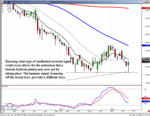
The question often arises, when is it time to cover short positions, or long positions for that matter. The best answer is when you can easily assess that there has been a change of investor sentiment at an obvious support level. If individual position can be seen to be setting up to form a potential reversal signal, closeout the positions. This could be seen in our recommendation today in the TUP chart. It was just about ready to break down through recent low areas. Had it closed near the low end of the trading range today, it would have been a set up for a bearish Jayhook pattern. However, with the price coming back up near the top end of the trading range of the day, it was potentially forming a Hammer signal, near the recent lows. Knowing what type of signals a price-move might be forming allows for much quicker decisions for when to get out of positions and be ready to establish positions in the opposite direction.

TUP
This is not difficult or involved technical analysis. This is taking the information that is built into each candlestick signal and applying it for the appropriate times to be getting in and out of trades. The visual aspects of candlestick signals allows for that extra anticipation of what type of signal could be forming. Take advantage of the visual aspects of these valuable trading tools. Using them correctly will definitely increase your profitability and reduce the emotional decision-making.
Good investing,
The Candlestick Forum Team
Speak Your Mind